Last week’s article on the 1970’s Rolling Stones reminded me of something that I would’ve rather forgotten: the Stones’ dreadful taste in album art.
If anything, it’s getting worse.
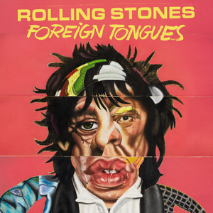
From 2024, here’s Frankenstone’s monster having a tummy ache:
Here’s a screen grab of something my kid cousin is cooking up in Blender:

Here’s a visual artist making a racist joke on his last day of work:
I would blame the Stones for taking their hand off the tiller as they became more about making money than making art, but, let’s be honest, the money was always the point and the (album) art was almost always dreadful.
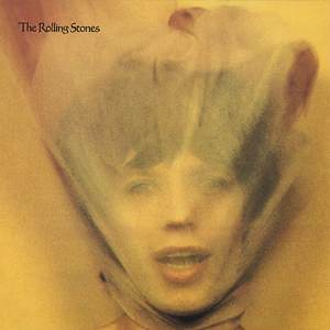
Here’s Mick Jagger’s head in a grocery bag:
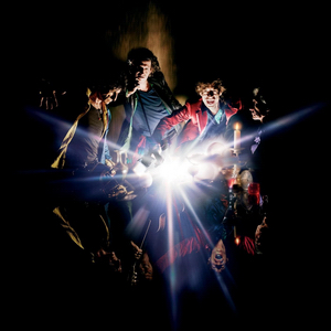
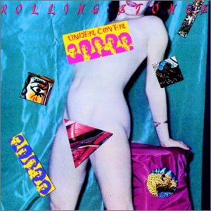
Here’s the band “flashing” us (groan):
Here’s the corpse of a woman killed by other Rolling Stones covers:
Fuck, I could keep going.
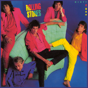
Mick bought this off of Fiverr for four dollars:

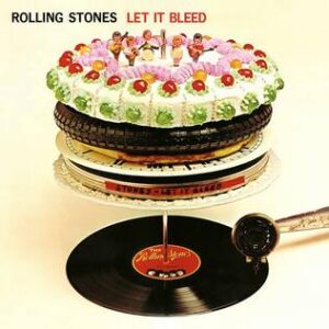
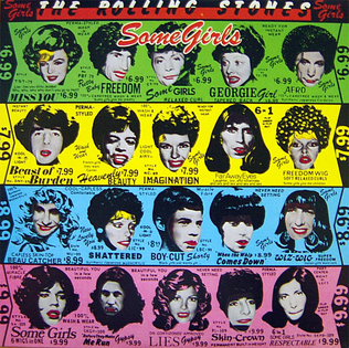
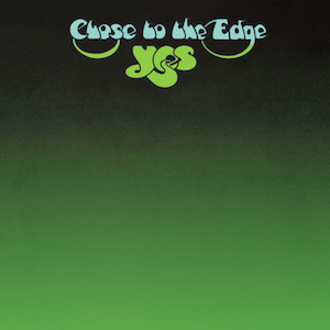
“Records are round. What else is round?” This album has appeared on so many best of lists that you might be tricked into thinking that it’s a good over. It is not:
Here’s Charlie Watts with his drum tech:

Here’s something I drew in first grade:
Here’s Charlie smuggling a swastika onto the cover of a platinum selling album. (Oh, you thought I was going to say something about them modeling for a men’s fashion line based on Tropical Skittles? That, too.):
Here’s Mick Jagger telling you, broadly, what he thinks about women:
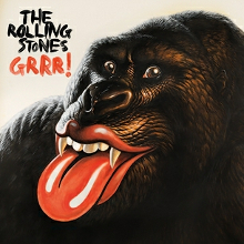
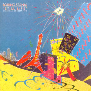
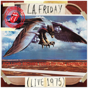
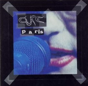
It’s a bird. It’s a plane. No, it’s Super-shitty-album-art-from-the-Rolling-Stones-again:
AC/DC has the lightning bolt.
![]()
Pink Floyd has the prism.
![]()
The Red Hot Chili Peppers have the asshole.
![]()
The Stones have the wet, disembodied mouth.
![]()
Some publications consider it the best band logo of all time.
I think it’s unpleasant to look at…which is unfortunate, because the Stones slap it on everything. Maybe AI should’ve taken this designer’s job:

I wish I could say that the Stones are the only great band with truly terrible taste in album art, but they’re, unfortunately, one of many.
The Cure have a magnificent career spanning six decades, and have arguably never been more beloved than they are today. But they may have one of the direst good albums to bad artwork ratios in the world.
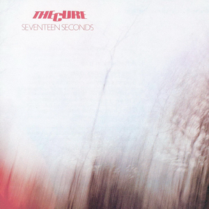
Here’s what it looks like when you remove the lens cap and snap a picture at the same time:
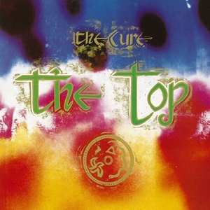
Here’s a rainbow that someone dropped and broke:
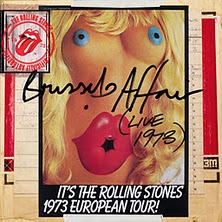
Here’s a close-up of the Rolling Stones’ lips:
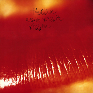
Here’s those same lips after they’re pulled out of a morgue’s deep freeze:
Goth typically have have good taste when it comes to visuals (as long as you’re cool with flesh the color of porcelain.) But what the fuck is this shit? Look, you put your kids scribbles on the refrigerator, not on an a media product you want to sell to millions of people:
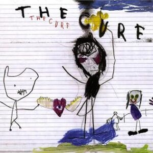
Oh no, it’s a motif. You wanna know the worst part? Robert Smith doesn’t even have any kids:

Everyone loved this album when it came out in 2023. No one mentioned the art, which seems as unfinished as the statue its depicting.

And then there’s Leonard Cohen, whose aggressively mediocre album prove that just because you’ve excellent taste in one field doesn’t mean it translates to others.
You’re supposed to listen to the lyrics because this Matisse squiggle ain’t giving you shit:

“Hey, Dad, we need another album cover. You know how you spent the last twenty years torturously refining your songs line-by-line, word-by-word, syllable-by-syllable? How about we package them with this photo I took of you in the back yard while trying out my new camera phone? We can just Photoshop out my shadow. Or maybe we can accentuate it!”

Once is a mistake. Twice is a motif:

This looks like your dad waking you up in the middle of the night and telling you that you have to leave right now because the “bad people” have found him again.

I used to think Leonard Cohen eating a banana on the cover of I’m Your Man was a power move, but, considering how the rest of his covers look, it feels like the best thing he could think of in 45 seconds.

Cohen was fucking Rebecca De Mornay when he recorded this album (it’s dedicated to her), yet instead of putting her gorgeous face on the cover, he went with this bad tattoo:

Dumbass.


Comments