“Don’t judge a book by its cover.”
What if the cover is this? DO NOT CLICK ON THIS LINK. IT’S GROSS AND DISTURBING.
Unless you’re a sicko who explicitly ignored my advice to NOT CLICK ON THIS LINK, I’ll do my best to draw you a picture….
Imagine a human jaw that is opened so wide that it’ll never close again. There you go. Marinate on that visual. BUT, UNDER NO CIRCUMSTANCE, SHOULD YOU CLICK ON THIS LINK TO SEE IT FOR YOURSELF. There are some experiences in the world that are better left unexperienced.
This link (which I cannot stress enough that you should absolutely not look at) is the cover “art” for Pissgrave’s 2019 album Posthumous Humiliation. I wonder how much research went into selecting it. Did the band have a three-ring binder full of grisly photos for research, or did they just randomly open The Mortician’s Guide to WTF Industrial Accidents and come across this disgusting masterpiece.
The cover fits their music like a glove. Pissgrave make old school death metal without any concessions like production or chops or entertainment. They make the audio equivalent of a snuff film. And their horrific covers ensure that potential listeners who’re not not on their repulsive wavelength will stay far away. The brutality of the album art provides a context for the brutality of the album.
Granted, you could argue the cover upstages the music. At the end of the day, death metal is fuzzy guitars, mouth noises, and banging, whereas a photo of a dude’s busted head is the last picture taken of a real human being who died in a really awful way. It makes music, even extreme music with violent mortality on its mind, seem inconsequential.
(Perhaps the band recognized this, as the only place you can see the uncensored cover is on the physical copies of their merch – and, oddly, Amazon streaming).
Love it or hate it (I hate it), at the very least, you have to admit that the cover of Posthumous Humiliation makes an impression…which is what this week’s column is about: why album covers matter.
My initial critical sensibilities filtered down from Gen-X indie rockers. They often had album covers that looked like this:

…which meant that I had some unlearning to do.
When you’re deep in the DIY scene, you’ll come across a guy (it’s always a guy), who’s hawking a self-recorded album with a title like Songs for Dicks, and the cover will be like a Bic-drawn boner with headphones on its glans and music notes surrounding it. Yeah, like a dick from Superbad. When asked why he went with such a half-assed and aesthetically unappealing cover, he’ll say, “All I want is people to think about the music.”
Ignoring the fact that the music probably sounds like it was recorded into a pillow and mixed on the deck of an aircraft carrier, the album’s cover communicates that he doesn’t give a shit about the music either.

I remember a WTF podcast interview when Marc Maron asked Sonic Youth’s Kim Gordon about what type of gear she used. She kinda laughed at him, like, “Marc, who gives a shit? That has nothing to do with what I do.”
Reading her memoir Girl in a Band, I was struck by how little Gordon mentioned music. Instead she discussed art, design, fashion, her relationships with other musicians, and music videos. I don’t remember her once mentioning “tone.”
Almost a year ago, we talked about the four pillars of a rock band: songs, players, gear, and aesthetics. Gordon primarily concerned herself with the aesthetics of the band: the look, the feel, how they related to prevailing artistic movements, how they interacted with the press. Although her Beat-inspired lyrics, disaffected vocals, affection for pop music, and bass playing contributed to the first three pillars of the band, it’s arguably her work on the fourth pillar that made the band beloved among the entire indie underground – men and women, punkers and poppers, alike. Without that particular girl in the band, SY would’ve been another Killing Joke or Swans, a dude band for dudes. It’s Gordon that made Sonic Youth cool.
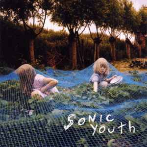
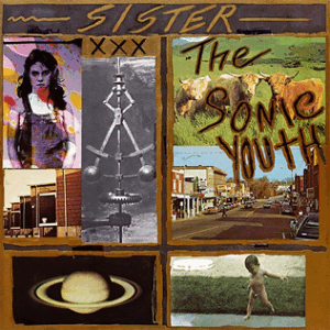
Nowhere is that coolness on display better than on its album covers, which ranged from the tranquil beauty of Daydream Nation and Murray Street to the cracked chaos of EVOL and Sister to the iconic ubiquitous t-shirt art of Raymond Pettibon’s Goo. Youth, and Gordon, swallowed culture and spat it back out in a way that boys in the thrall of Guitar World magazine could never.

This week’s Heck Record is one of the best albums with absolutely dreadful cover art, Beck’s 1994 debut Mellow Gold. Beck’s lo-fi, stoner hip-hop noise introduced the world to a singular musical talent right out of the gate, but in approving the use of this apocalyptic robotic monstrosity, he showed that musical talent doesn’t necessarily translate into a visual medium.
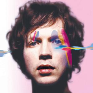

For someone who has such a prodigious imagination, and a willingness to dig deeply into the production of his songs, I find it unusual that his artwork always seems like an afterthought. At his best (Sea Change), he’s aping Bowie, and at his worst he’s not trying at all (is that just a picture of the studio floor for Modern Guilt?) Oddly, his most recent album 2019’s Hyperspace, may have his best artwork.

I, however, can’t attest to the music, because I haven’t listened to it. His past decade of smoothed-out pop and therapy folk has kind’ve turned me off of him, which makes Mellow Gold all the more special. We’ll likely never see Beck as freewheeling, joyous, and (yes) tasteless as we do here.
Still wish it had better art, though.


